We use cookies to make your experience better. To comply with the new e-Privacy directive, we need to ask for your consent to set the cookies. Learn more.
Inside the Palette Part 1: Dementia Design Through the Eyes of Our Interior Designer
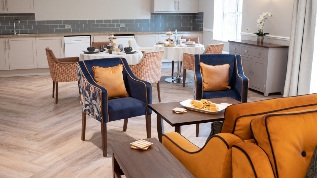
Well-designed physical surroundings are important, but nowhere more so than in care homes. Embark on a journey into dementia-friendly design with Hollie, Edison & Day's very own interior designer. Guided by Hollie's expertise, in part 1 we explore the nuanced use of colour, strategic contrast in design elements, and the balance between aesthetics and functionality. Look out for part 2 based around navigating spaces...
Evolving Design Principles
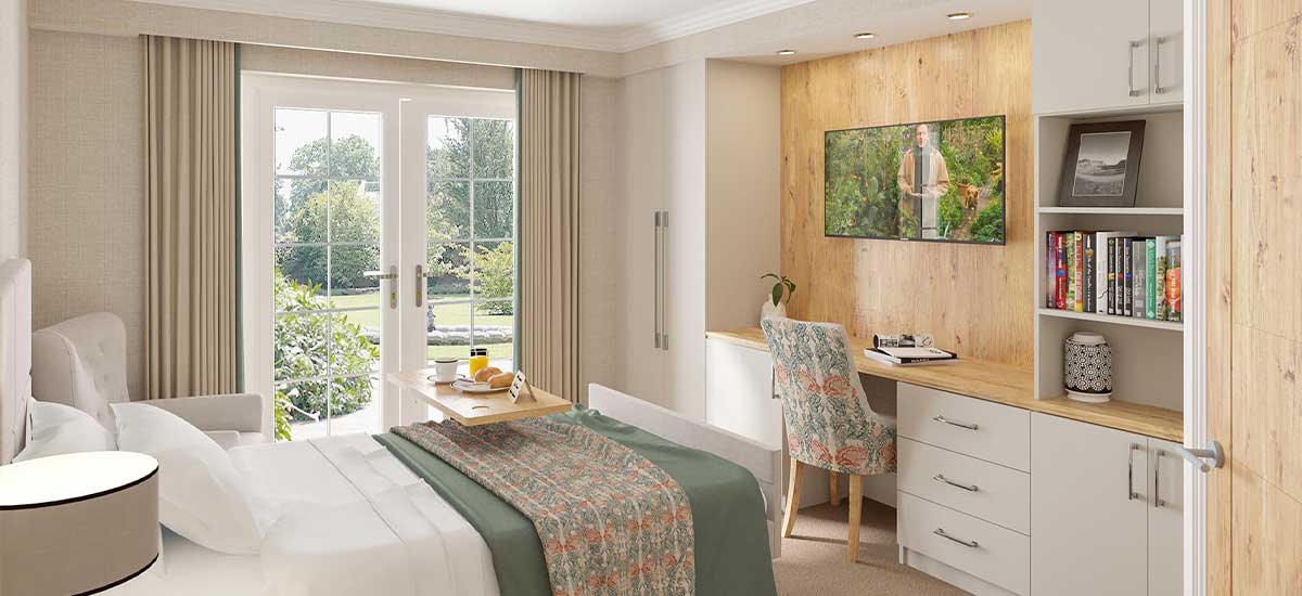
Contrast is a word often heard when working with dementia design, and, according to Hollie, is possibly the first thing to get right when putting together designs and floorplans for dementia care homes. In many ways, maintaining contrast is important, she explains, but so is minimising contrasts and transitions between different rooms. "Changes in surfaces can confuse residents with dementia," she adds, emphasising the importance of keeping Light Reflectance Value (LRV) differences low. "LRV differences are essentially if you had a gradient of light to dark of colours from 1-100, where if there's a really big LRV difference then there will be a high contrast between surfaces." Hollie uses the example of having 2 different flooring types such as carpet and vinyl which are closely matched in terms of their LRV value working better - she recommends being within 10 points of each other. This means that they would be more similar in terms of what our eyes would see, even if they are different colours, as their tone would be close.
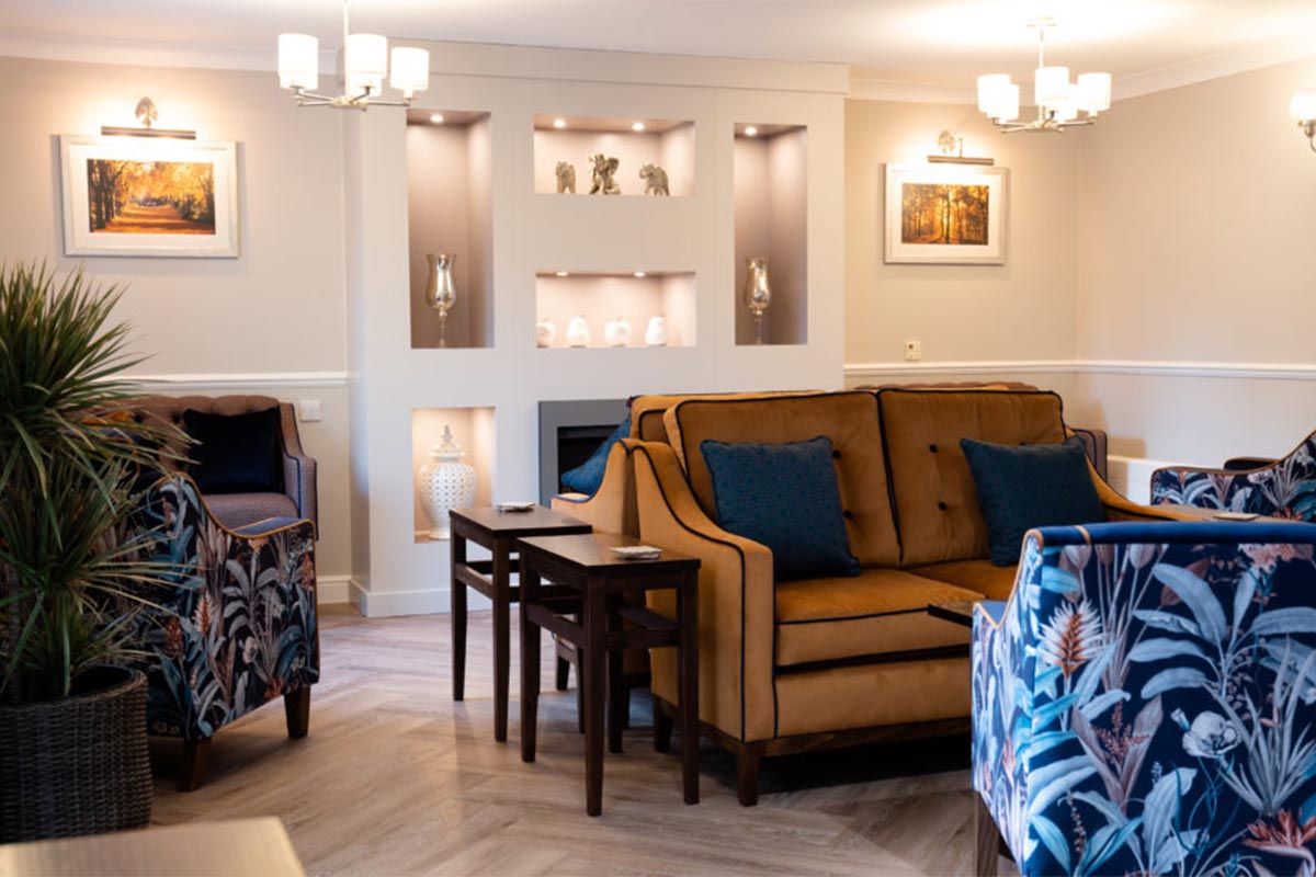
Avoiding harsh patterns is equally important, although Hollie makes it clear that the thoughtful and purposeful use of patterns can be a key tool when ensuring that rooms are visually interesting for the people who are spending the most time in them. "Sometimes things can look like other things for residents," Hollie notes, cautioning against high-contrast patterns which could look too life-like and avoke fear or confusion. Instead, she opts for botanical and floral patterns with softer colours.
Hollie also recognises the value of contrast, through the careful selection of patterns, materials and colours to avoid visual misinterpretation. "Contrasting colour can make clear distinctions between different objects in a room," she explains. From leading edges on curtains to contrast piping on chairs, these subtle touches add depth to design. These things can sometimes be tricky to incorporate without the help of dementia design specialists like Hollie and Edison & Day's lead designer Sarah Scott, who can make it possible to enjoy the best of both worlds and have a home that is well-designed and adapted for residents and dementia, whilst remaining visually appealing to other residents and/or visitors, and ensuring the palette choices match your home or group's needs and brand identity.
Colour Selection
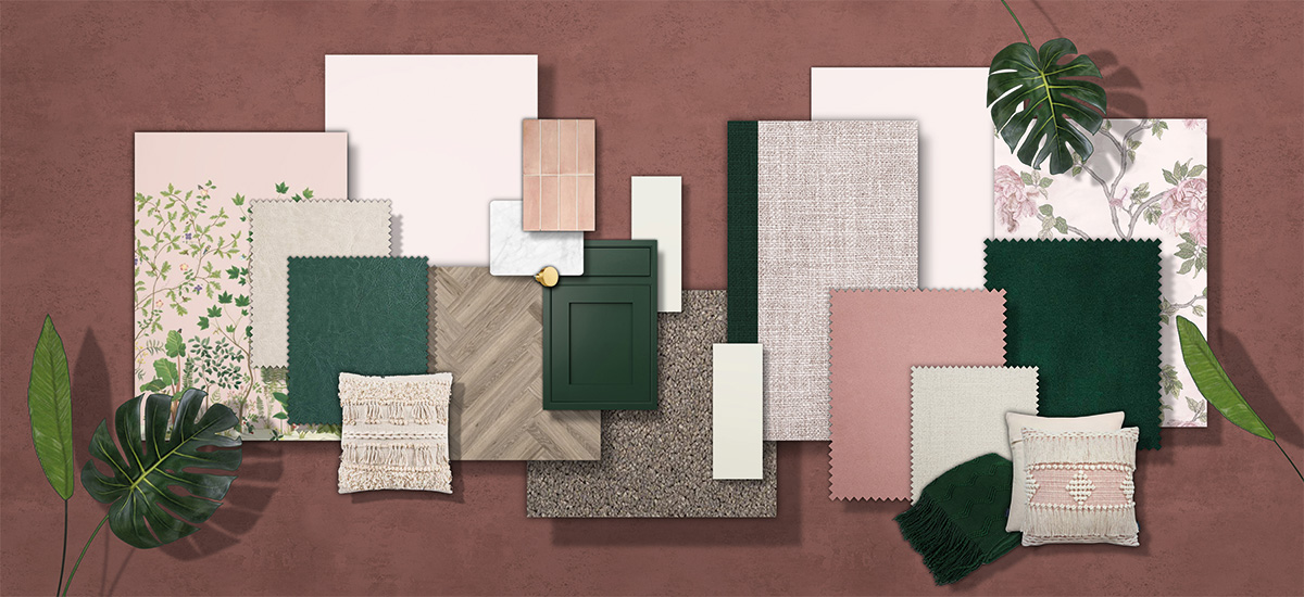
Colour selection is an important topic, making up the majority of the choices when creating dementia-adapted room schemes. Hollie emphasises that it's important not to drain all the colour from a room in fear of over-stimulation, as colour variety is great for dementia. She suggests using colour varieties and ensuring that rooms are bright and vibrant. "Blues and greens are often used when creating rooms for dementia residents. However, whilst they are calming tones, cooler shades like these are most likely the first colours that residents will lose as their eyesight weakens. Warmer shades such as oranges and pinks tend to remain for a lot longer." Hollie warns against using red though, as it can panic residents with its connotations of warnings and danger.
"In a past project," Hollie recalls, "we faced a challenge with a kitchen that had dark flooring and lighter door fronts." The solution? "We ensured that was a contrasting worktop and a strong splashback tile, as well as choosing contrasting handles that were matte to avoid unwanted reflectivity," she explains, highlighting the importance of thoughtful design solutions.
Stay tuned for the next part of our journey, where we'll explore the significance of clear signage and purposeful accessories in navigating spaces for residents with dementia...

