We use cookies to make your experience better. To comply with the new e-Privacy directive, we need to ask for your consent to set the cookies. Learn more.
The Art of Colour: Creating Spaces That Speak
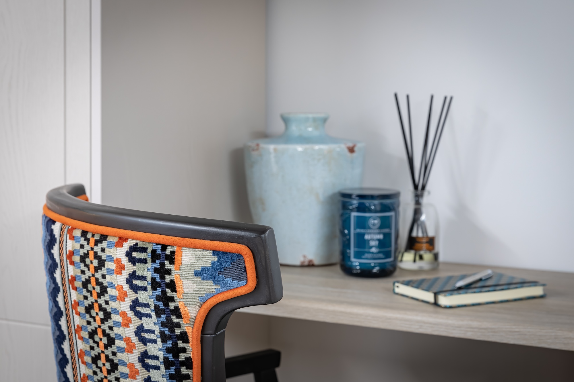
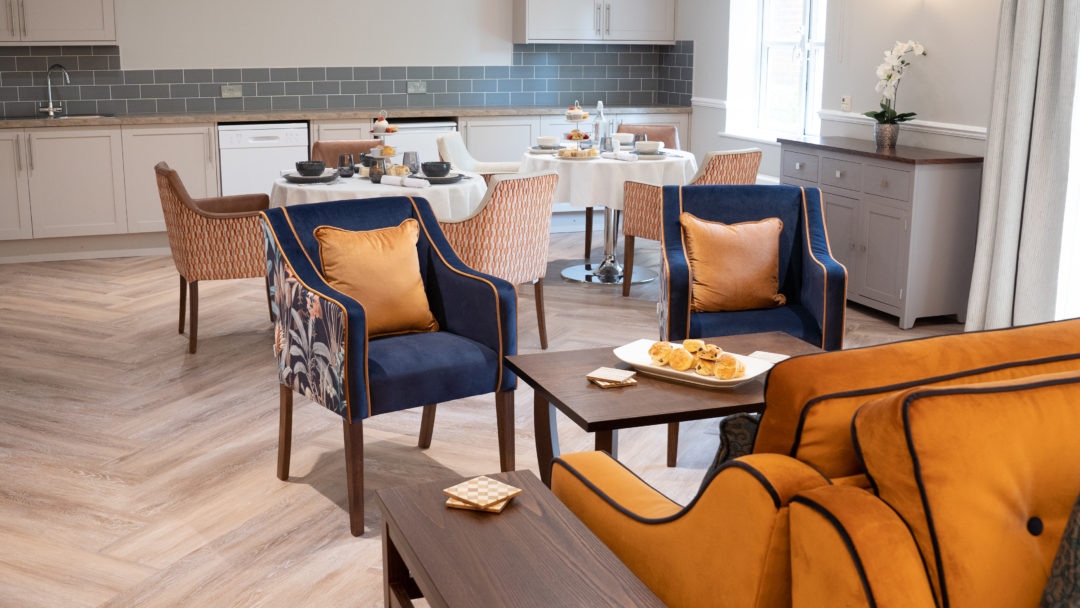
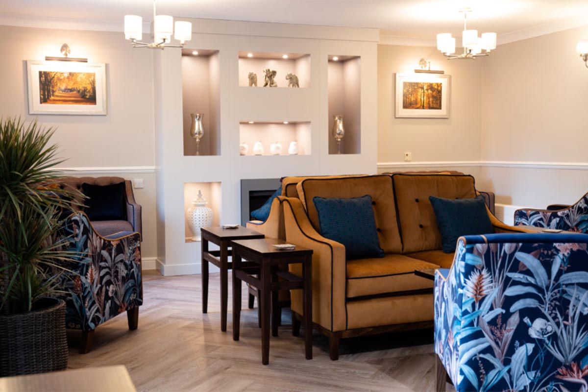
In interior design, colour is far more than an aesthetic choice — it’s a language. One that can set the mood of a room, tell a story, or elevate the everyday into something exceptional. At Edison & Day, we understand the impact colour has in care environments, and how tailored furniture and finishes can help designers deliver spaces that feel both meaningful and memorable. We spoke with interior designers Sarah and Hollie, who shared their perspectives on how colour can be used with purpose — to enhance, support and bring spaces to life.
The Creative Power of Colour
As someone originally trained in fashion and textiles, colour and pattern have always been at the core of Sarah's creative journey. Her experience with oil painting has provided her with a profound understanding of colour interactions, and she is particularly fascinated by how secondary colours can complement each other, creating striking combinations that narrate a story. "In my 30s, I studied fine art, which allowed me to delve deeper into the use of colour. I now enjoy translating that knowledge into interior design," she reflects. Whether employing a monochromatic scheme or a contrasting palette, Sarah believes that colour choices significantly influence the mood of a space and can be used to highlight or soften various areas.
Finding the Right Palette
For interior designers like Sarah and Hollie, colour is more than a design element — it’s a tool to shape atmosphere and tell a story. “When I meet new clients, I often try and grasp from them what colour palettes they prefer,” Sarah explains. “If it’s not a personal choice of theirs then it’s what feeling they want to create in the room, and colour is a key way of helping to reflect that.” That kind of intuitive design thinking demands materials and finishes that can adapt — whether that’s bespoke upholstery, colour-matched furniture, or entirely new combinations developed to suit a specific scheme. Access to made-to-order solutions gives designers the freedom to experiment with colour in a way that feels both purposeful and personal — ensuring that every scheme is as carefully crafted in detail as it is in concept.
Hollie from Studio Aitchay brings a special focus to colour selection when designing for dementia care. She emphasises that the right contrast in colour is essential for aiding recognition and orientation — helping to create environments that are not only beautiful, but supportive and intuitive to navigate.
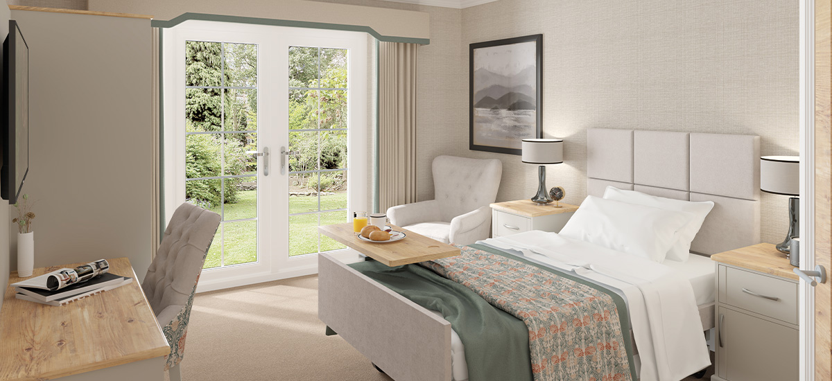
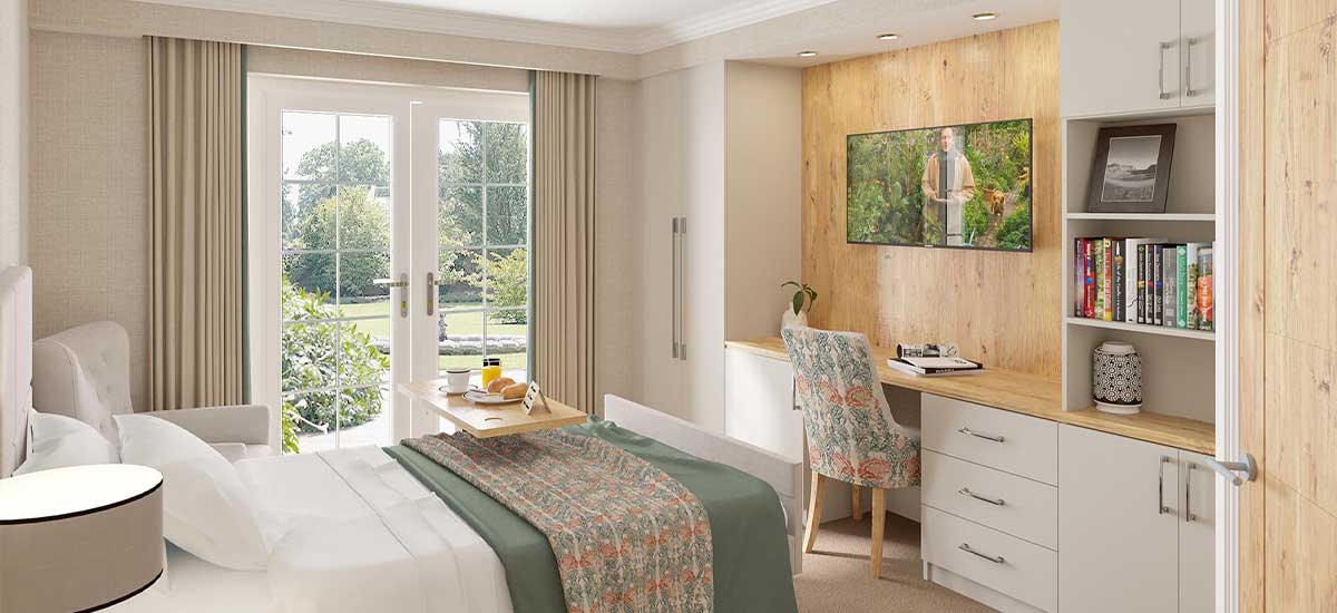
In a recent project, they collaborated with a care home group to reinterpret corporate colours into bedroom schemes. The design process culminated in four distinct schemes, each reflecting elements of the organisation's branding. Their inspiration often stems from various sources, such as the heritage of a building, its location, or even the name of a particular room. For instance, in designing the Olive Grove suite for RCH Brentwood, Hollie drew upon an Italian theme, incorporating orange tree motifs in the wallpaper and a rich palette of oranges and greens. The result was a distinctive, character-rich suite — brought to life through made-to-order furniture and detailing by Edison & Day, crafted to meet both the aesthetic and functional needs of the care setting.
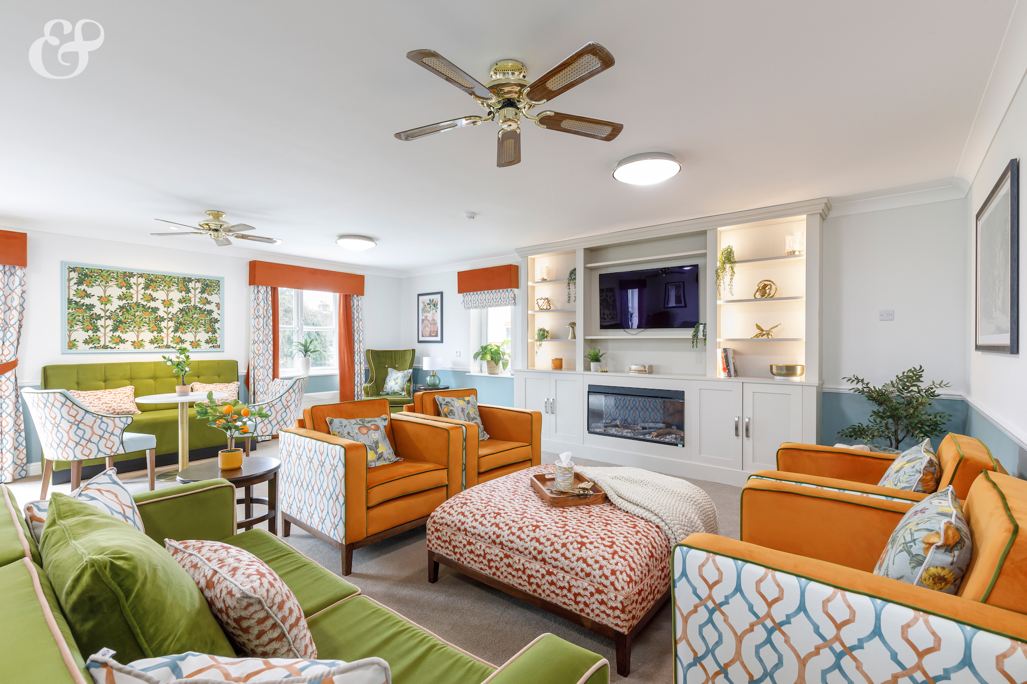

In the Olive Grove suite at RCH Brentwood, vibrant orange and green hues intertwine with bespoke furnishings to create a Mediterranean-inspired sanctuary that is both inviting and functional. This design not only enhances the aesthetic appeal but also supports the well-being of residents by fostering a warm and familiar atmosphere.
Colour Inspiration from Art & Design
Events like WOW!house and London Design Week offer Sarah and Hollie a fresh perspective, often sparking new concepts and directions for upcoming projects. “When I attend exhibitions like that, I focus on the different uses of colour — how it’s layered, contrasted or balanced — because it helps me bring new ideas into my work with clients,” Sarah explains. She notes, as an example, how the colour composition in a painting can inspire an entire room scheme, seamlessly blending art with interior design.
Colour is more than just a visual element; it's a tool for communication and expression. Whether harmonising hues within a palette or using contrasting shades to create a focal point, the choices made in colour can profoundly impact the atmosphere of a space. It's about creating harmony and balance, or sometimes, making a bold statement that stands out. Thoughtful use of colour, as seen in the work of designers like Sarah and Hollie, reminds us that interiors are more than just spaces — they’re experiences, shaped by emotion, memory and meaning.

